Our visual guidelines
Free to use when you’re talking or writing about readywhen — articles, partnerships, decks, press. All assets below are © readywhen and can’t be used for any other purpose. Please don’t redraw, recolour, or remix the marks.
About readywhen
Why we exist
We believe in a world where nothing gets between great people and great work.
What it is
readywhen captures everything you say you’ll do across meetings and tools, then brings it back done.
How it works
It connects to everything. Zero building needed. Does all the busywork you weren’t hired for.
The name
Always lower-case — readywhen, one word, never “Readywhen”, “ReadyWhen”, or “Ready When”. When the name appears in body copy, mirror the logo: ready in bold, when in italic.
Other tools record. readywhen acts.
Example usage in running copy.
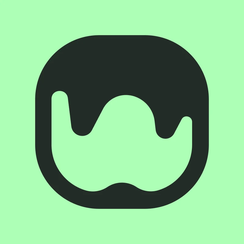
Logo
Two marks, two ink variants. The full lockup pairs the symbol with the wordmark and is the default. The app icon stands alone for tight spaces — favicons, social avatars, app tiles. Use the mint variants on dark surfaces, the dark variants on light or mint surfaces.

Lockup — mint (for dark backgrounds)

Lockup — dark (for light backgrounds)
App icon — on dark
App icon — on mint
App icon — on light
Do
- Keep clear-space around the mark equal to the height of the “r”.
- Use the dark variant on the brand green and on photography.
- Scale proportionally — the wordmark sits at 21 px in our nav.
Don’t
- Don’t recolour, outline, or add effects to the mark.
- Don’t separate the symbol and wordmark in the full lockup.
- Don’t place the dark mark on a busy or low-contrast background.
Meet Inky
Inky is our octopus mascot — eight arms, eight things on the go, none of them dropped. Use sparingly: one Inky per layout, never as a logo replacement.

Inky

Inky on watch

Inky done
Backgrounds
Atmospheric backdrops for decks, social posts, and partnership assets. Grainy, gradient-led, mint-and-teal. Use behind hero copy or as a section divider — keep type on top in light ink and leave generous breathing room.

Backdrop 01

Backdrop 02

Backdrop 03

Backdrop 04

Backdrop 05

Backdrop 06
Colour
Two backgrounds set the stage — deep green and warm off-white. One accent does the lifting: a bright mint that signals action, success, and the moment a thing gets done.
Backgrounds
Background / Dark
#232C27
Background / Light
#F3F7F3
Lift / Dark
#28332D
Depth / Light
#EFF4EF
Accent
Accent / Primary
#ACFFB6
Accent / Darker
#329A3F
System
UI / Success
#2AD87F
UI / Warning
#C56A21
UI / Error
#C9372D
Typography
Four families. Display for confidence, mix for warmth, body for clarity, mono for the small print.
The things you said you’d do.
Not a to-do list. A done list.
Captures everything you say you’ll do across meetings and tools, then brings it back done.
30-SECOND SETUP · OAUTH · SOC 2
Voice
Direct. Confident. Never busy. We sound like the colleague who quietly took it off your plate.
We say
- Done.
- It catches everything.
- Zero building needed.
- Brings it back done.
We don’t
- Revolutionary AI productivity platform.
- Supercharge your workflow.
- Leverage cutting-edge LLMs.
- Reimagine work.
Press & partnerships
Writing about us, partnering, or pitching a collaboration? Reach out and we’ll send through anything you need that isn’t already on this page.